Oriyali / Women’s wellbeing
A quiet place to understand your cycle
Brand identity and a privacy-conscious PMDD education and self-check experience, designed and built as one product.
- Sector
- Women’s wellbeing
- Contribution
- Brand, Product + Web Design and Development
- Services
- Brand identity · Product design · Web design and build
- Period
- 2026

The brief
How can a sensitive health experience help someone recognise a repeating pattern without sounding clinical, dismissive or falsely diagnostic?
DUKU developed the brand and illustration direction, shaped the information architecture and interactions, and built the public website and its on-device self-check and daily check-in explorations.
01 / The problem
Make a recurring experience legible.
Oriyali is for people trying to understand difficult changes that return around the same point in their cycle. The public website introduces PMDD, explains why timing matters and offers a place to examine a pattern before the next appointment. The challenge was to be direct about the subject without reducing someone’s experience to a symptom list.
The product began with a simple sequence: recognise the pattern, understand the cycle, try a self-check, see what a daily record can show and learn what to take to a clinician. That sequence became both the information architecture and the narrative spine of the website.
02 / Brand world
Warmth with enough precision to be useful.
The botanical mark, illustrated landscapes and changing light establish a softer entry into the topic. A woman resting in the grass gives the page a recognisable human scale. Type, colour and spacing stay clear enough for practical guidance, questions and source notes to remain easy to read.
The visual language is designed to change with the content. Day and night scenes and the rhythm of a month support the idea that experience shifts over time. Illustration is used to orient and reassure; the screening and record sections use a more structured presentation.
03 / The journey
Why, what and how.
The site moves through three clear parts. Why names the pattern and the cost of waiting for an explanation. What makes the phases of a cycle visible and introduces the screening questions. How shows the daily record, offers practical guidance for a doctor’s appointment and previews the check-in ritual.
This structure lets someone enter through an emotional question and leave with a concrete next step. An interactive cycle scene changes with each phase, making time and transition easier to grasp without implying that every person experiences a month in the same way.
The public product journey
Recognise
Name the repeating experience in plain, human language.
Understand
Make cycle phases and symptom timing visible through interaction.
Check
Present the published screening questions and explain their limits.
Prepare
Show what a dated record can contribute to a clinician conversation.
04 / The self-check
Useful answers, careful boundaries.
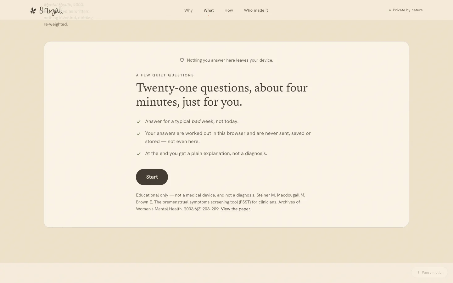
The live self-check presents the published Premenstrual Symptoms Screening Tool questions and shows its scoring rule. It asks about timing, symptoms and impact on everyday life, then helps a visitor read their responses in context. The result is framed as a screening signal to discuss with a clinician, never as a diagnosis.
The interaction is designed to be private and understandable. Answers stay on the device, and the logic is visible rather than hidden behind a score. Plain language around the tool makes clear what it can and cannot establish.
05 / The record
Turn a memory into something dated.
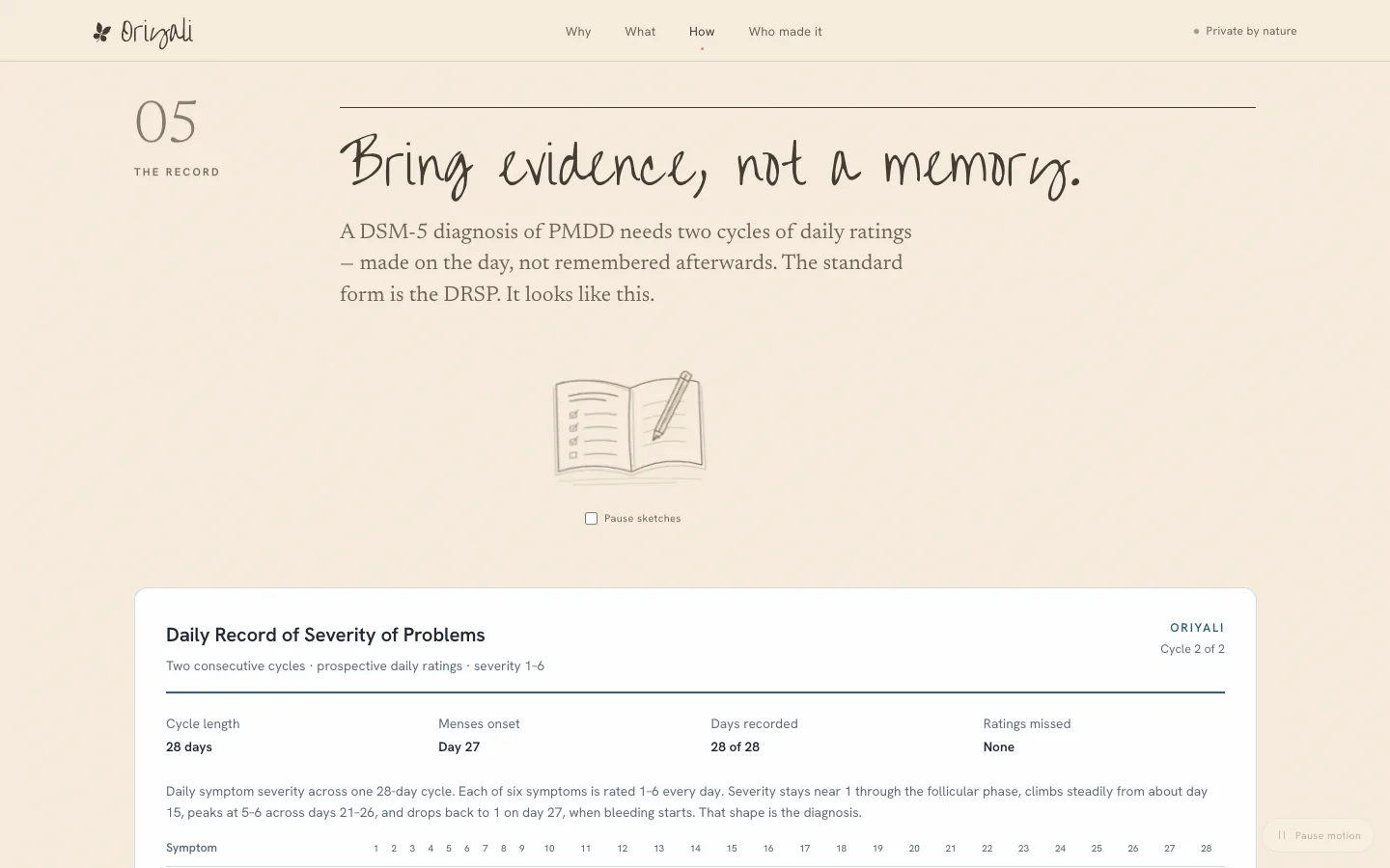
A sample Daily Record of Severity of Problems shows what two cycles of prospective ratings can look like. The example chart makes a repeating change legible across a month, then explains how a person might bring that record into an appointment. Its figures are explicitly sample data, not a reported patient outcome.
This part of the build bridges education and action. The page gives visitors language for the timing of their symptoms and shows what evidence a clinician may find useful, while keeping clinical interpretation with the clinician.
06 / Daily check-in
A small ritual with a visual response.
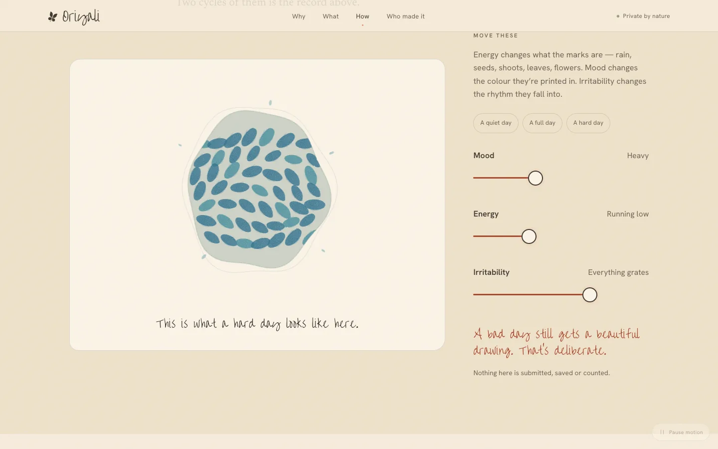
The interactive check-in exploration uses three controls for mood, energy and irritability. As the values change, a field of hand-drawn marks changes its form, colour and rhythm. Even a hard day receives a considered image; the experience does not punish someone with a harsh visual state.
On the website, this is an interactive preview of the intended daily ritual. It is not a stored health record. The planned iPhone app is described separately as the place where daily entries could become a two-cycle record and a warning before a difficult week.
07 / Privacy and scope
Privacy is part of the product architecture.
The public experience states that self-check and check-in interactions do not send answers away from the device. The only outward submission on the page is the optional email sign-up for news about the iPhone app. That separation makes the promise legible at the point where someone might otherwise hesitate to interact.
The complete live website connects identity, education, interactive explanation and a privacy-first product preview. The iPhone companion remains in development, so the portfolio describes the web experience as shipped and the app as planned.
From the working archive
More from the archive
07 frames


Project references