Amrit Rastogi Diamonds / Fine jewellery / Ecommerce
A jewellery house, from identity to checkout
Brand identity, a considered Shopify store and the ongoing work of presenting made-to-order fine jewellery online.
- Sector
- Fine jewellery / Ecommerce
- Contribution
- Brand, Ecommerce Design + Store Management
- Services
- Brand identity · Ecommerce UX · Shopify store management
- Period
- 2026

The brief
How do you make an online diamond purchase feel as considered and reassuring as a conversation with the person making it?
DUKU developed the visual identity and art direction, designed the ecommerce journey, and managed the Shopify storefront across merchandising, product content and customer-facing information.
01 / The brief
Make the house recognisable before a product is selected.
Amrit Rastogi is a design-led fine jewellery house selling solid-gold, lab-grown diamond pieces and taking private commissions. The challenge was broader than making a store look luxurious. A customer had to understand the point of view behind the jewellery, find a piece, compare material choices, and feel comfortable placing a made-to-order purchase online.
The work connected brand identity, photography, content, commerce design and store management. Each touchpoint needed to express the same quiet confidence while answering the practical questions that arise before an expensive, personal purchase.
02 / Identity
A signature built around resolved form.
The identity starts with the original monogram and wordmark. Their measured proportions sit within a palette of house green, ivory and oxblood. Typography and generous space give the jewellery authority without surrounding it with ornamental noise.
That system extends beyond a logo placement. It sets the rhythm for collection introductions, founder storytelling, packaging and digital surfaces. The brand book informed these public-facing choices; its internal operating and governance material is intentionally absent from this portfolio.
03 / Art direction
Show the piece, the person and the making.
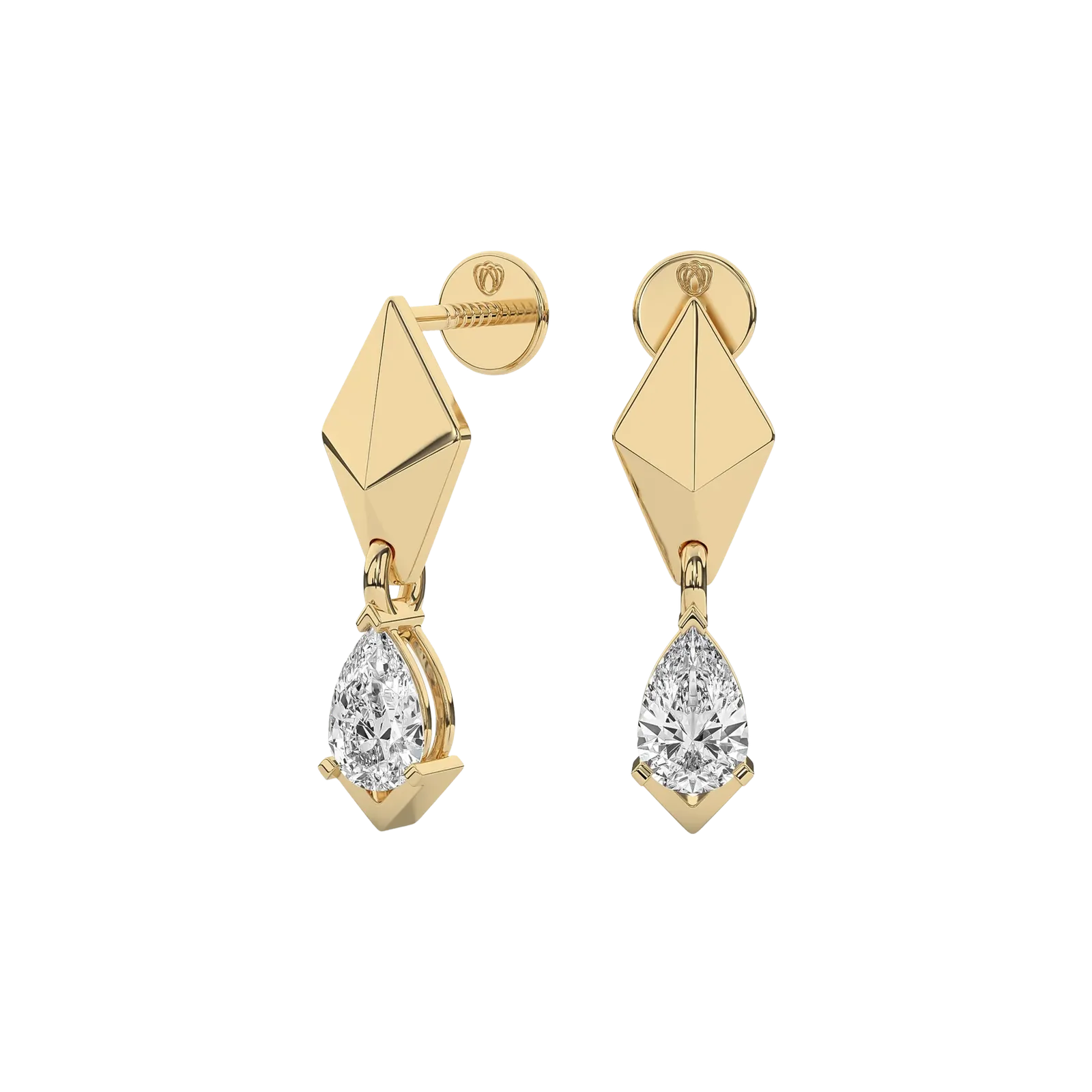
Three kinds of imagery work together. Clean product views reveal shape, stone setting and finish. Portraits show how a piece lives on a person. Details from the workbench and architectural settings connect the jewellery to craft, proportion and material.
The photographic treatment uses warm surfaces, directional light and restrained compositions. It gives the catalog consistency while leaving individual pieces room to be distinctive.
04 / Storefront
Two paths through one house.
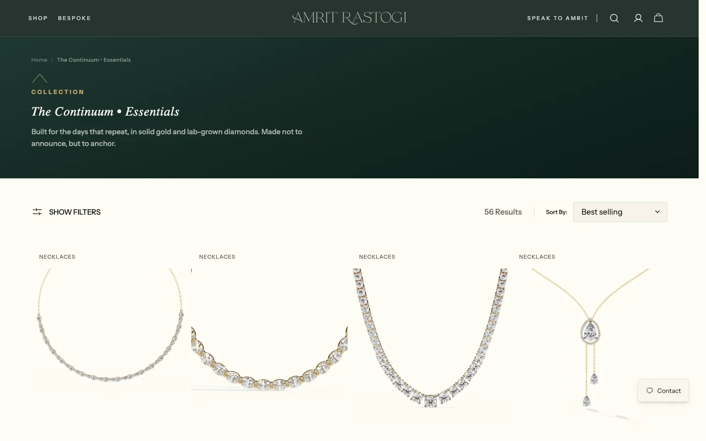
The Shopify experience separates ready-to-explore collections from private commissions. The Continuum collection gives shoppers a direct route into rings, earrings, pendants, necklaces and bracelets. The bespoke path explains how an idea becomes a finished piece, with consultation, design approval, sourcing and craft described in sequence.
Collection pages make the range browsable and searchable. Editorial modules bring the founder and design philosophy into the journey at points where they provide context, while education and client-care pages answer questions about diamonds, metals, sizing, certification, shipping and returns.
From identity to a working store
Define the house
Establish the mark, palette, typography and image direction before designing commerce surfaces.
Shape discovery
Organise collections and the bespoke route around the two ways people come to the house.
Resolve the decision
Connect product imagery, material choices, certification and policies on the product page.
Manage the catalog
Maintain product content, variants, imagery and guidance as new pieces are added.
05 / Product detail
Help a customer decide with their eyes open.
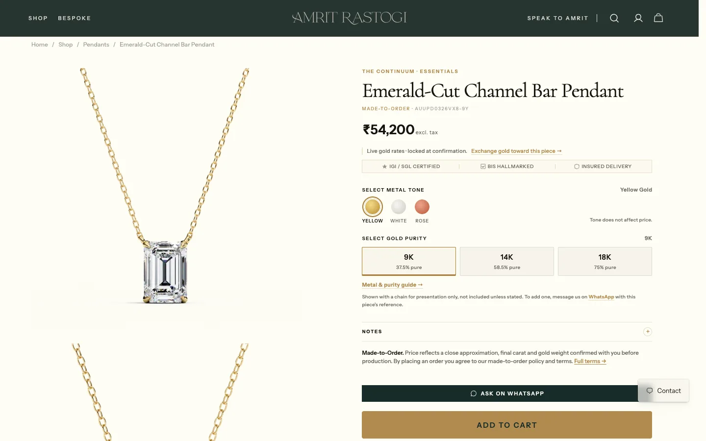
Product pages bring the buying decisions into one place: imagery, price, metal tone, gold purity, craft details and the next action. Guides explain the material choices. Certification, hallmarking, insured delivery and made-to-order terms are placed near the decision rather than hidden behind a generic promise.
The conversion work focused on removing uncertainty near the cart: showing what changes with a material choice, placing policies beside the action, and offering a direct question or consultation. For fine jewellery, a clear route to a human is part of the ecommerce experience, especially when a customer is considering a commission or a change to a piece.
06 / Shopify operations
Keep the store coherent after launch.
The Shopify scope covered the ongoing work behind the storefront: organising collections, managing product content and imagery, maintaining variant and material information, and keeping customer-facing guidance aligned with the catalog. The design system had to survive ordinary store updates, not only the launch composition.
That operational view shaped templates and merchandising. Product names, imagery, specifications and care information follow a consistent structure, making new pieces easier to publish and easier for customers to understand. The store presents commerce and brand as one maintained product.
07 / The result
A complete brand-to-commerce experience.
The live store now carries the same identity through first impression, collection discovery, product evaluation, bespoke enquiry and checkout. The case study shows the design and operational scope visible in that experience. Sales and conversion figures are omitted because they have not been verified for publication.
From the working archive
More from the archive
08 frames




Project references