Miracle of Mind / Wellness
A daily practice with almost nothing in the way
Designing a calm, accessible meditation product around a five-minute practice and the many reasons people return.
- Sector
- Wellness
- Contribution
- Senior Product Designer
- Services
- Product strategy · Mobile UX · Interface design · Launch readiness
- Period
- 2024–2025
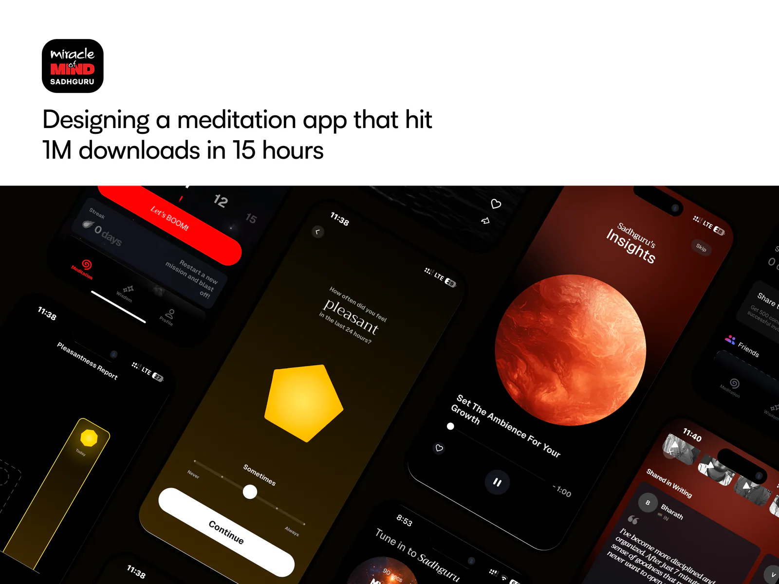
The brief
The product had to welcome a global launch audience, then become quiet enough for each person to begin their own practice.
DUKU designed onboarding, meditation, mood reflection, return states and habit patterns from the first concept through continued product evolution.
01 / Human scale
Design one quiet beginning
Miracle of Mind set out to make meditation approachable to people arriving with very different levels of familiarity. A global launch can be discussed in large numbers; the product itself still meets one person, in one moment, deciding whether to begin.
The design therefore stayed close to a human-scale promise: a five-minute practice, a simple path in and an experience that does not demand expertise before offering value.
02 / Onboarding
Let the practice be the explanation
Onboarding gives enough context to set an intention, then shortens the distance to a first session. It avoids turning meditation into a feature tour. Choices that matter before the practice—such as duration and audio—appear when they become useful rather than as a long setup sequence.
This also creates a more honest first impression. People understand the product through the rhythm of using it, not through claims about what it may do for them.
The first ritual
Arrive
Acknowledge the moment and present one clear way to begin.
Prepare
Choose only what changes the immediate practice.
Practice
Reduce interface presence while preserving essential control.
Return
Close gently, reflect if useful and leave the next visit open.
03 / Practice flow
The screen is meant to disappear
Before a session, the interface supports a small number of deliberate choices. During meditation, visual information recedes. Controls remain predictable and reachable, but do not ask for attention. The end state returns gradually and makes completion clear without turning it into a performance score.
This restraint is functional. Every animated flourish, status element and prompt was considered against the product’s real purpose: helping someone stop looking at the phone.
04 / Return states
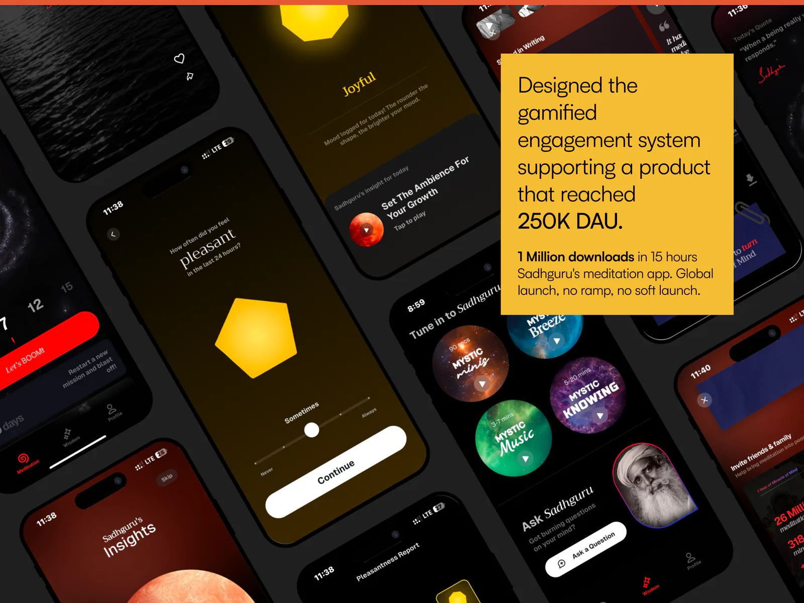
A returning person should not feel like a new acquisition
The home experience changes after the first practice. The next session is easier to reach, while quotes and short audio ideas provide lower-commitment ways to reconnect. Progress is available, but the product does not make yesterday’s absence the centre of today’s visit.
Return states distinguish encouragement from pressure. They recognise continuity without treating a broken streak as failure.
05 / Mood reflection
Reflection without a clinical label
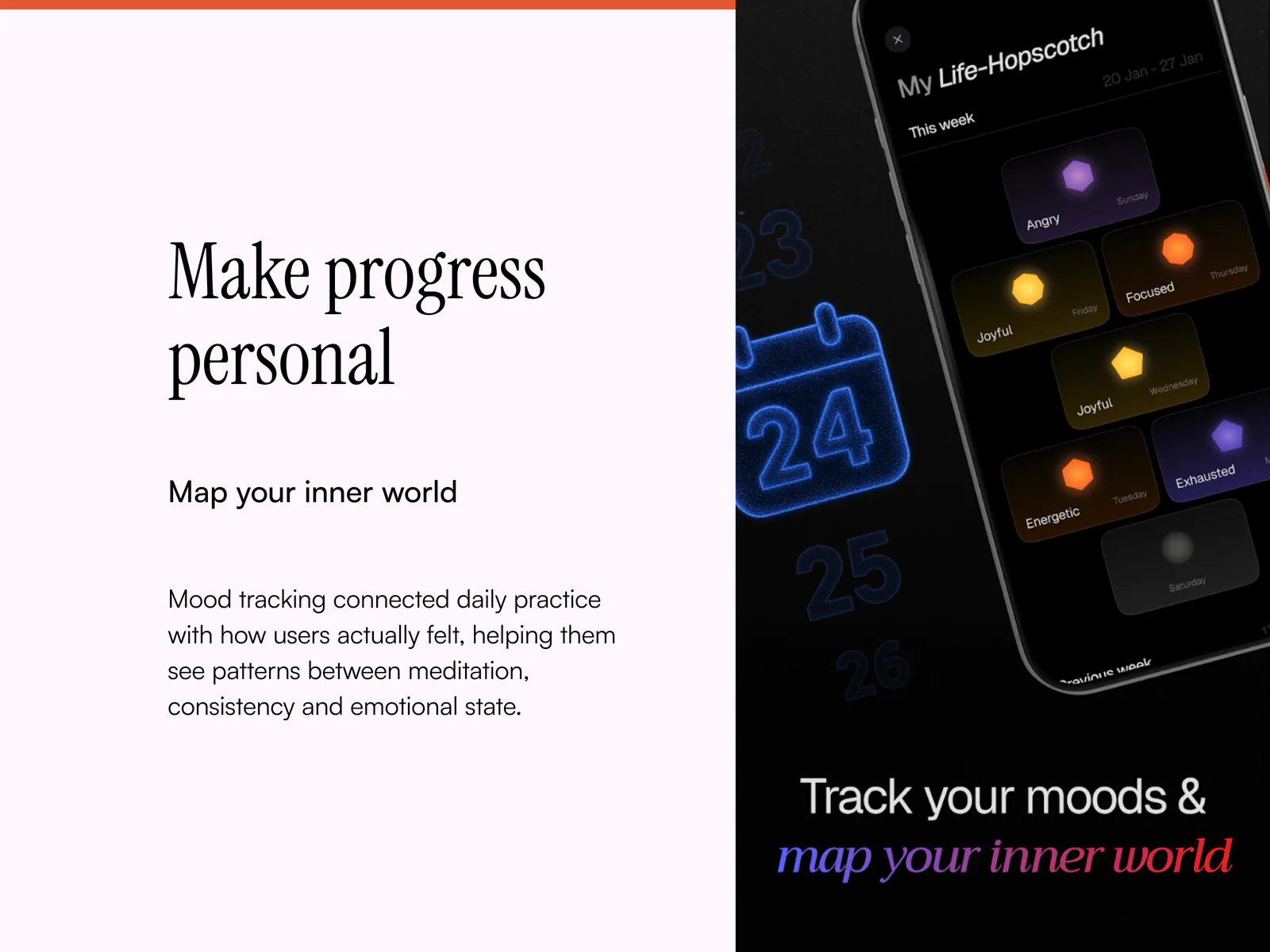
Life-Hopscotch gives people a lightweight way to record pleasant and unpleasant feelings. The interaction supports noticing a pattern without diagnosing it. Language remains observational and avoids implying a medical conclusion.
The visual model makes contrast legible while allowing mixed days to exist. A person can look back without being reduced to a single colour or score.
| Moment | What a person may need | Interface response |
|---|---|---|
| Ready to practise | The shortest path to begin | Resume or select a session directly |
| Curious but time-poor | A lighter way to reconnect | A short quote or audio insight |
| Looking back | A pattern without judgement | Mood reflection across time |
| Returning after a gap | Permission to start again | A neutral welcome without loss framing |
06 / Habit without pressure
Encourage consistency without moralising it
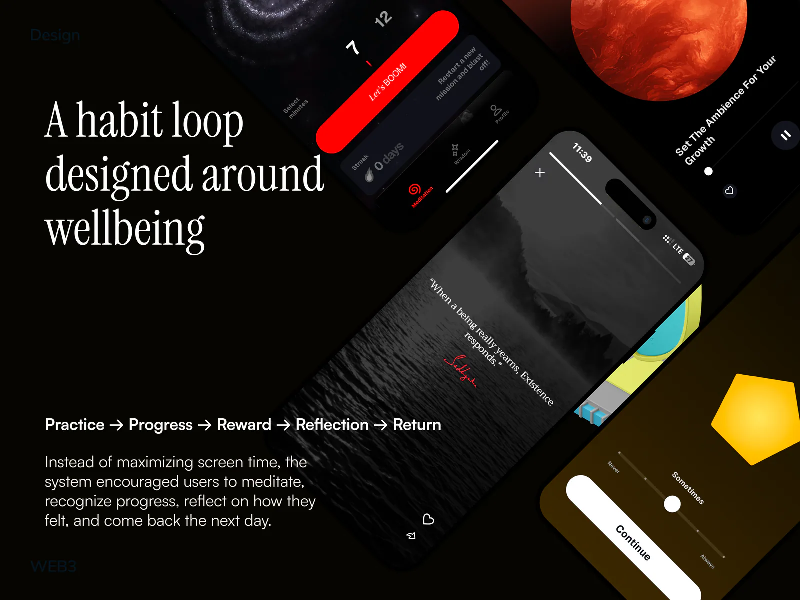
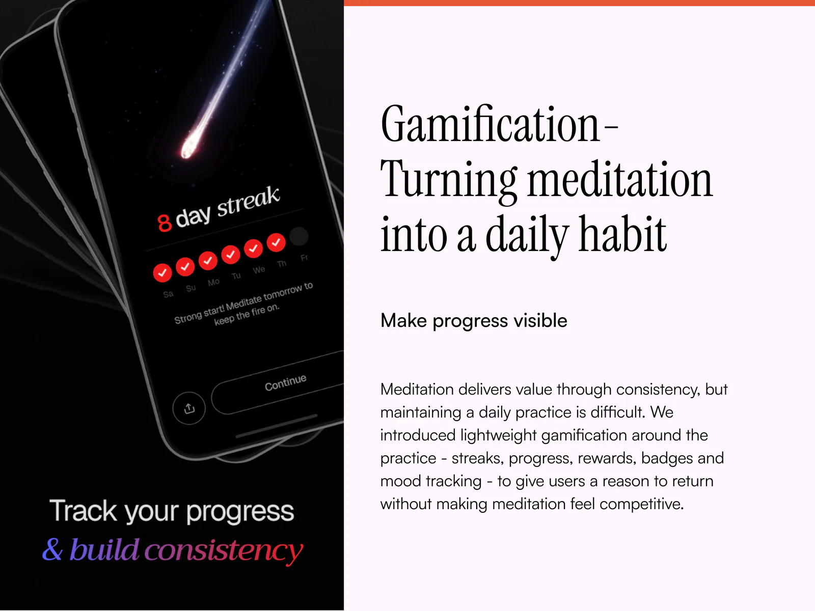
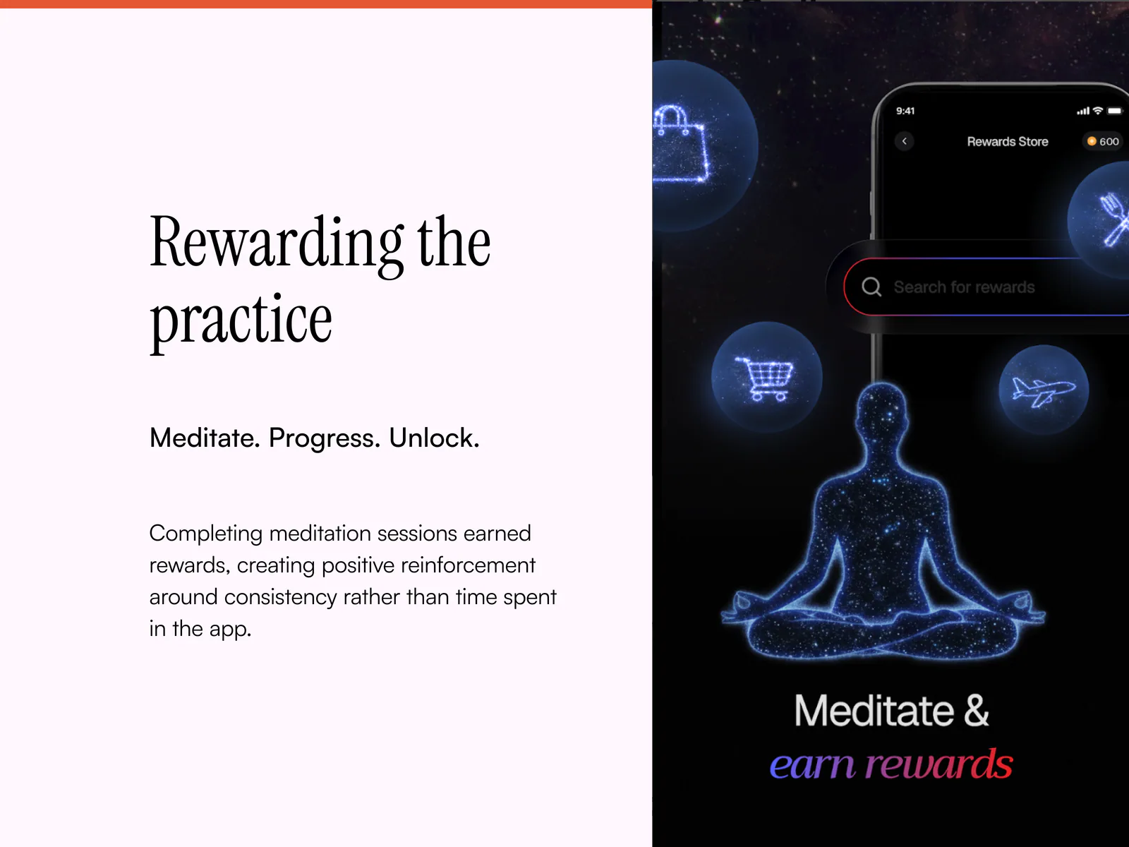
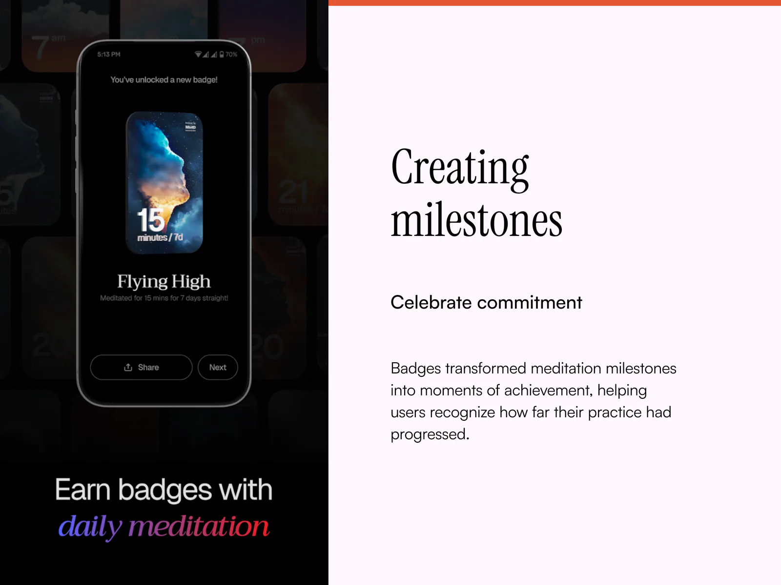
Streaks, coins and levels can make progress visible, but meditation should not become another source of guilt. Habit patterns acknowledge effort and make continuity easy to see while avoiding shame language, urgent countdowns or punitive recovery states.
A missed day does not erase the value of returning. The product keeps the practice—not the mechanic—as the primary action.
07 / Accessibility and localisation
Calm must remain usable
Quiet visuals still need strong contrast, readable type and clear focus. Essential controls remain labelled and available to assistive technology. Meaning is not communicated through colour or motion alone, and reduced-motion preferences remove non-essential transitions.
The content structure accommodates longer translated phrases and different reading rhythms. The experience can change language without changing the logic of the practice.
08 / Launch readiness
Design for the surge and the day after it
A highly visible launch makes edge cases part of the main experience. Loading, retry, interrupted audio, incomplete onboarding and time-zone differences were treated as product states rather than engineering footnotes. The same care continued after launch as new patterns and content were added.
The result was a product system able to support a public moment and a private daily ritual with the same underlying clarity.
09 / Evidence boundary
Reach is not the same as proof of wellbeing
The original story reports substantial launch and engagement figures. Those figures are not published here while their sources, measurement periods and permissions are being reviewed. Even when verified, reach and session completion should not be presented as clinical evidence. This case study documents the product contribution and keeps that distinction explicit.
From the working archive
More from the archive
05 frames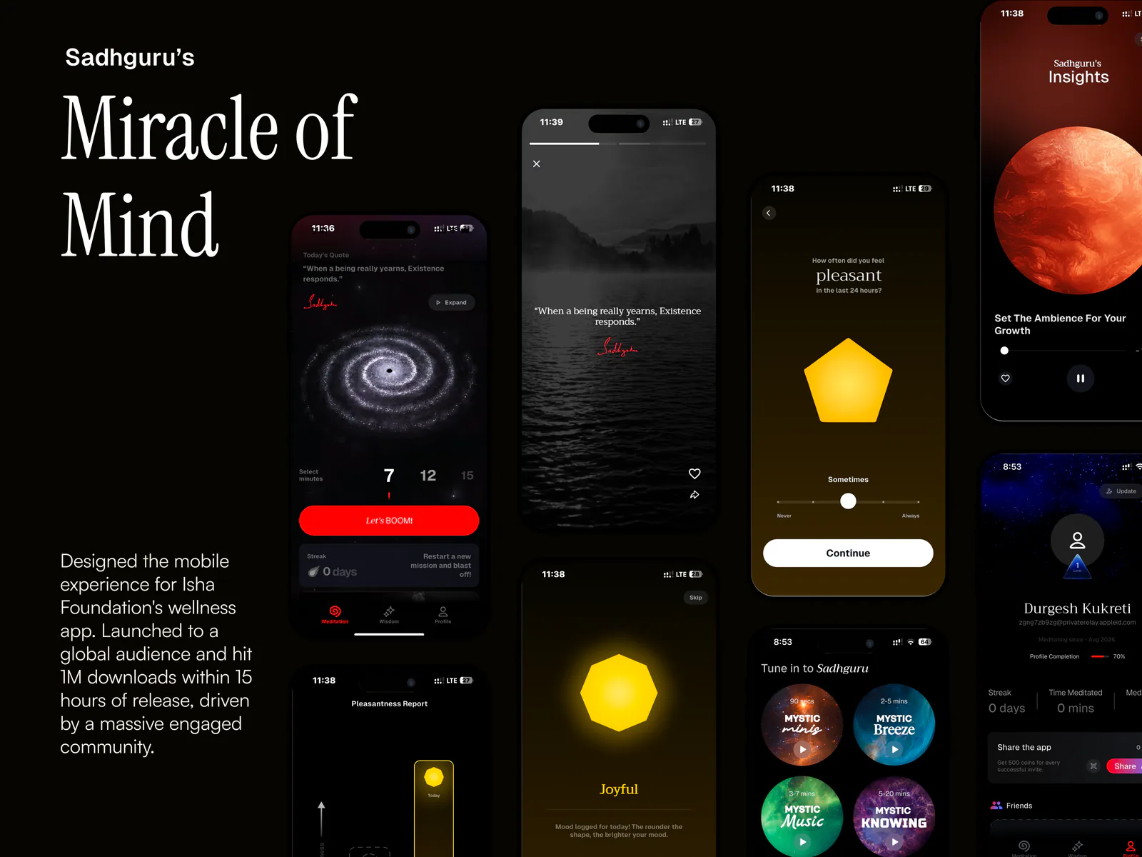
Project references