LinkByCar / Mobility / Fleet SaaS
From fleet data to the next clear action
How decision clarity reshaped a connected-fleet platform, its scoring products and the system beneath them.
- Sector
- Mobility / Fleet SaaS
- Contribution
- Product Design + Product Management
- Services
- Product strategy · Information architecture · UX and interface design · Design systems
- Period
- 2024–ongoing
The brief
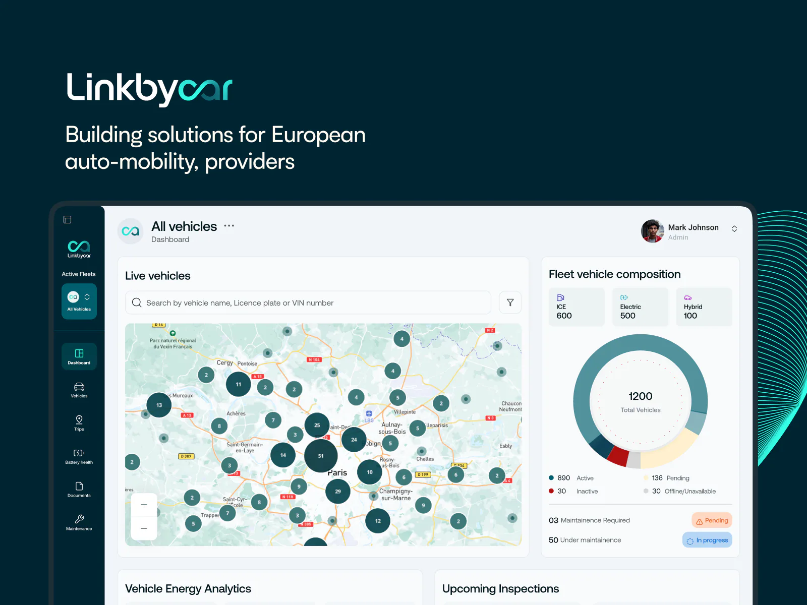
The platform could locate a vehicle, but operators still had to assemble the meaning of its data before they could act.
DUKU reframed the dashboard around tasks, created Battery Care and Safety scoring experiences, and built a component foundation for continued product growth.
01 / Fleet context
Connected vehicles create information before they create understanding
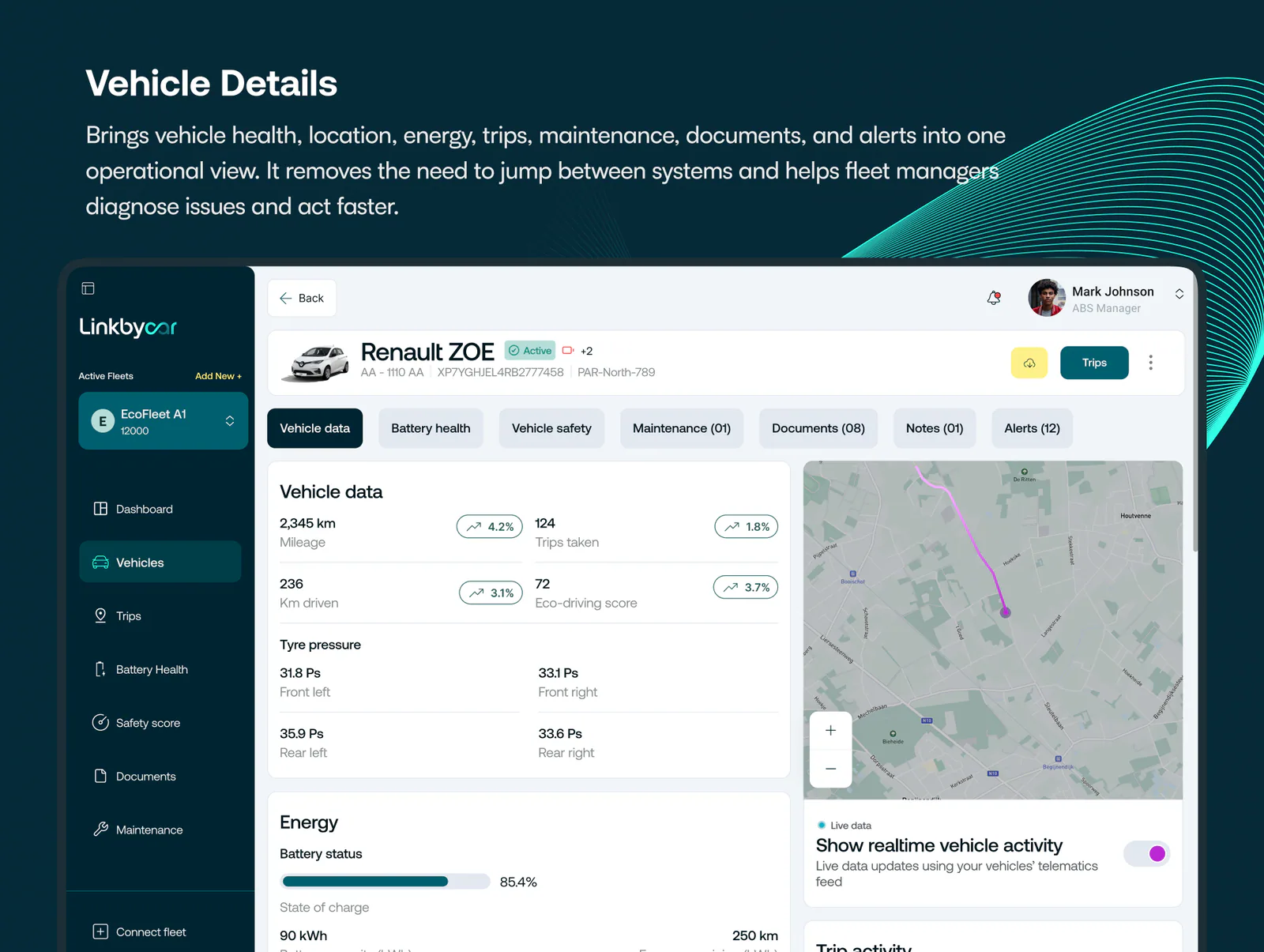
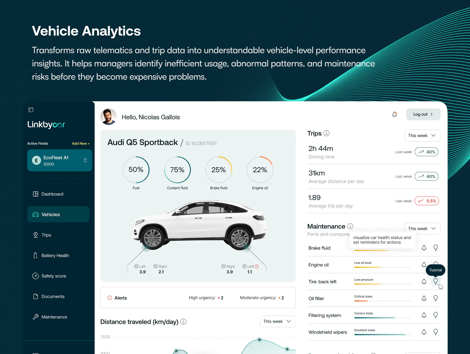
LinkByCar brings together location, battery condition, charging, driver behaviour, trips and maintenance for enterprise fleets. Rental operators, logistics teams, insurers and fleet managers may look at the same vehicle while asking very different questions.
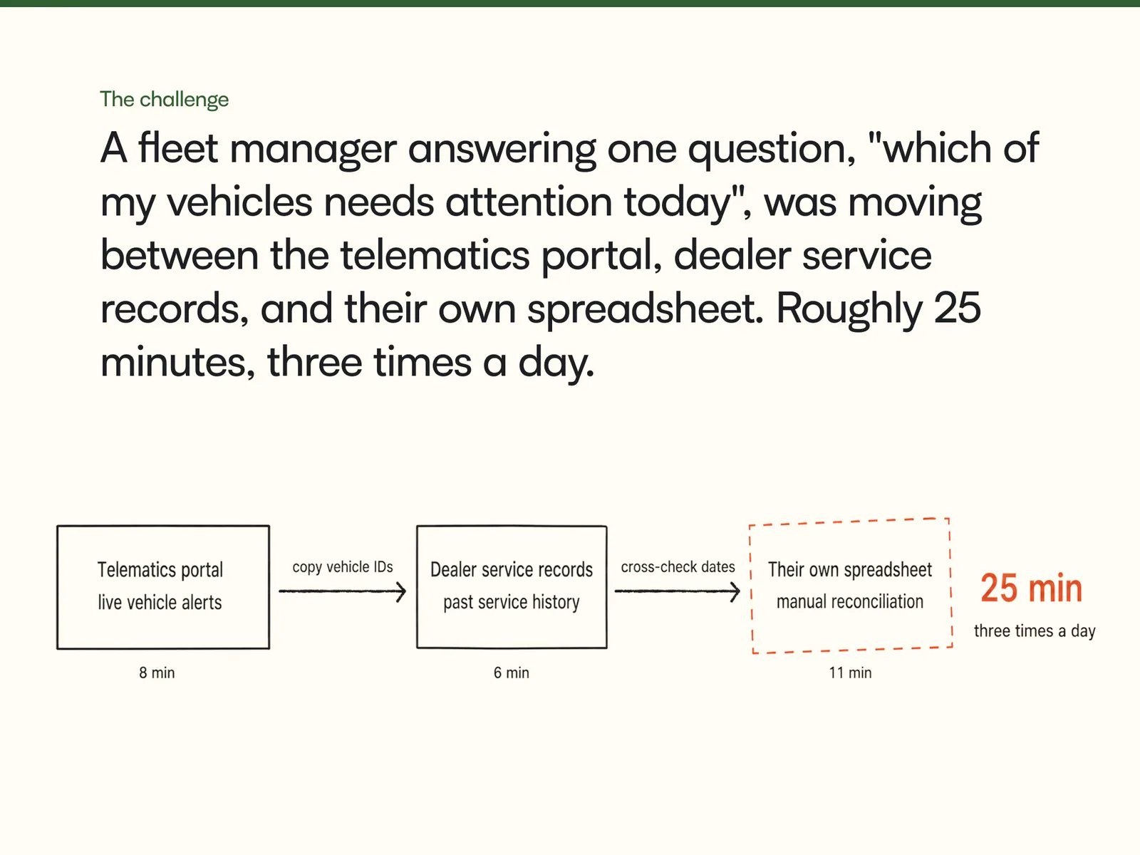
The early product proved that data could be collected and shown. The next challenge was product-shaped: how should the experience organise that information so an operator could notice a condition, understand its significance and move directly into a task?
02 / The first sixty seconds
Start with what an operator came to do
Product conversations were anchored in a simple window: the first minute after someone opens the platform. They may need to find a vehicle, review a critical alert, check a battery or investigate a trip. The home surface should shorten those paths rather than compete with them.
This shifted the design from “what can the system display?” to “which decision deserves attention now?” It also provided a durable way to assess future features: if an element did not improve orientation, prioritisation or action, it did not automatically belong on the dashboard.
From signal to action
Notice
Surface a condition with enough context to judge its urgency.
Understand
Explain which vehicle, behaviour or trend created the signal.
Act
Place the relevant operational task beside the evidence that supports it.
03 / Information architecture
Organise by frequency and purpose
The navigation moved away from a growing list of capabilities and towards recurring fleet tasks. Fleet overview, vehicles, trips, alerts and analytical views gained clear homes. Secondary configuration stayed available without occupying the same visual tier as live operations.
The map remained important, but no longer had to be the entire product. It became one coordinated view of the fleet, connected to lists, filters, status summaries and vehicle detail rather than competing with them.
04 / Dashboard anatomy
Status first, evidence next, action close by
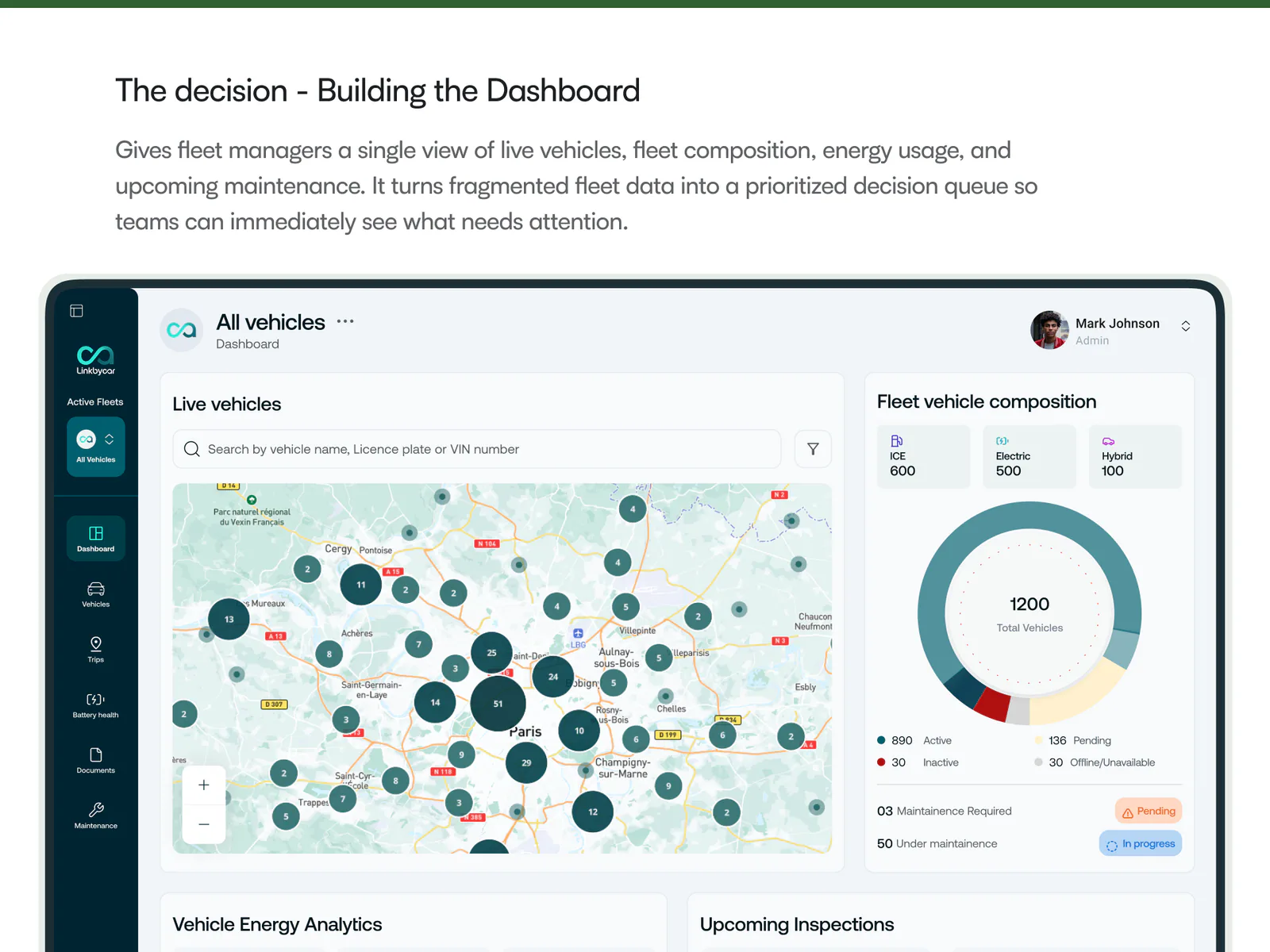
The dashboard establishes the fleet’s current state before asking someone to explore. Summary areas distinguish normal operation from items that need review. Alerts carry a reason and affected object. Vehicle and trip access remains direct for people who arrive with a specific task.
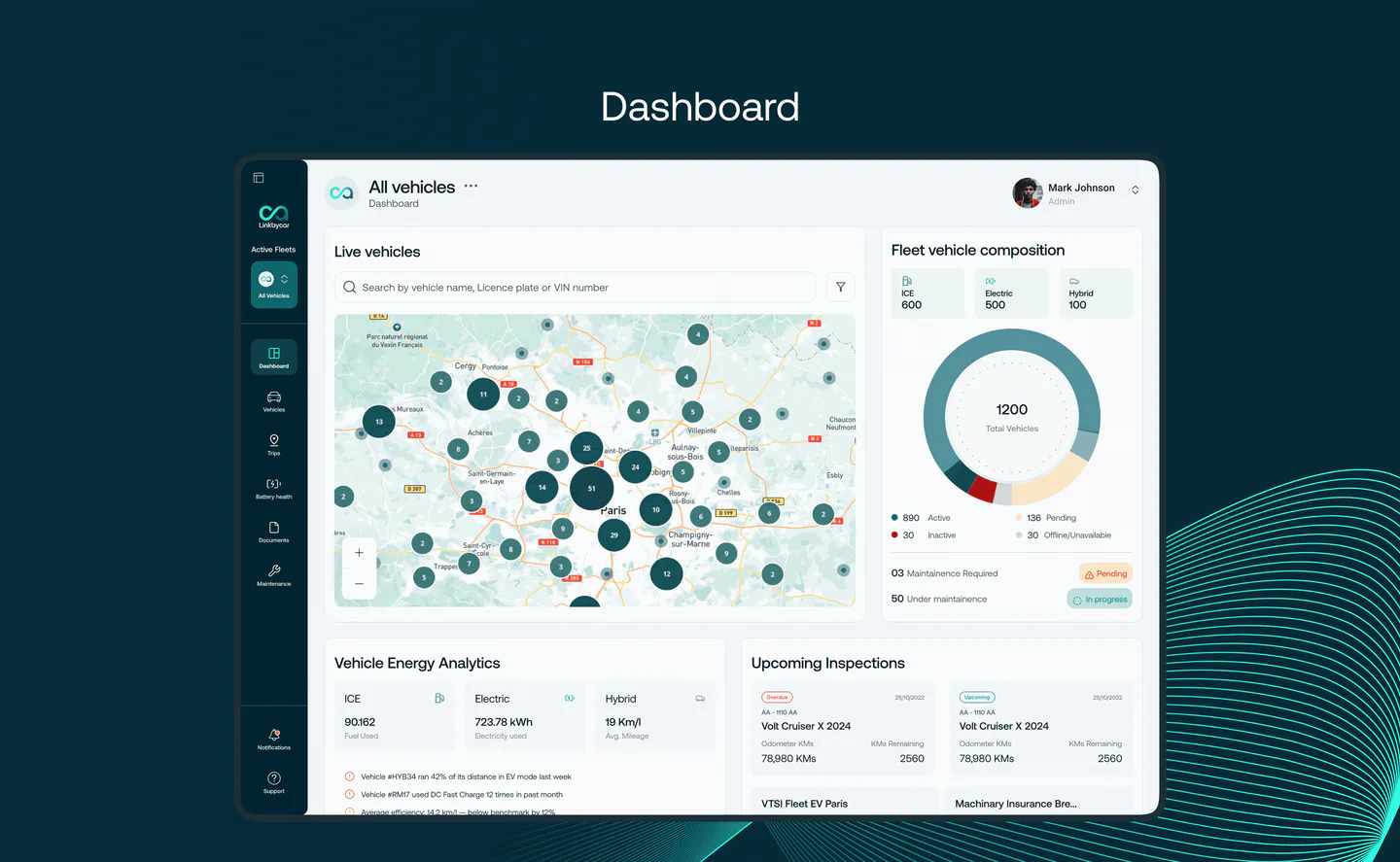
The dashboard creates a reading order from fleet status to evidence and then to the relevant vehicle or task.
- Operational overview
The first layer answers whether the fleet needs attention.
- Actionable signals
Alerts explain the condition rather than presenting an unexplained count.
- Multiple paths in
Map, list and search support operators who begin with different information.
05 / Battery Care Score
A score is useful only when it explains itself
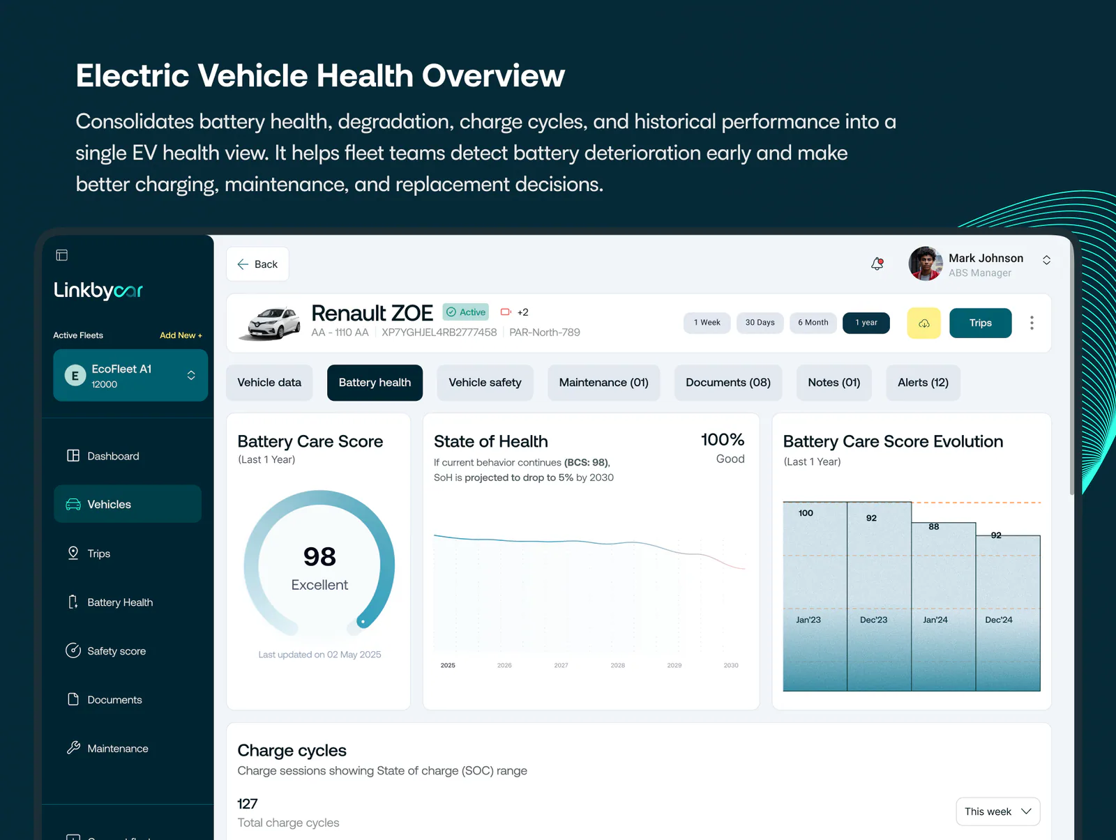
Battery Care combines state of health, charging habits and degradation patterns. A single number can support comparison, but cannot carry a maintenance decision alone. The experience pairs the score with its direction, contributing factors and a recommendation an operator can evaluate.
The design separates immediate condition from longer-term behaviour. That prevents a healthy value today from hiding a deteriorating trend, and keeps advice tied to the evidence that produced it.
| Layer | Operator question | Product response |
|---|---|---|
| Score | Which vehicles need comparison? | A stable summary value with explicit status |
| Trend | Is condition improving or degrading? | Time-based direction and meaningful change |
| Factors | What contributes to this result? | Charging and health signals shown separately |
| Recommendation | What can the team do? | A specific operational suggestion with context |
06 / Safety scoring
Translate telemetry without flattening responsibility
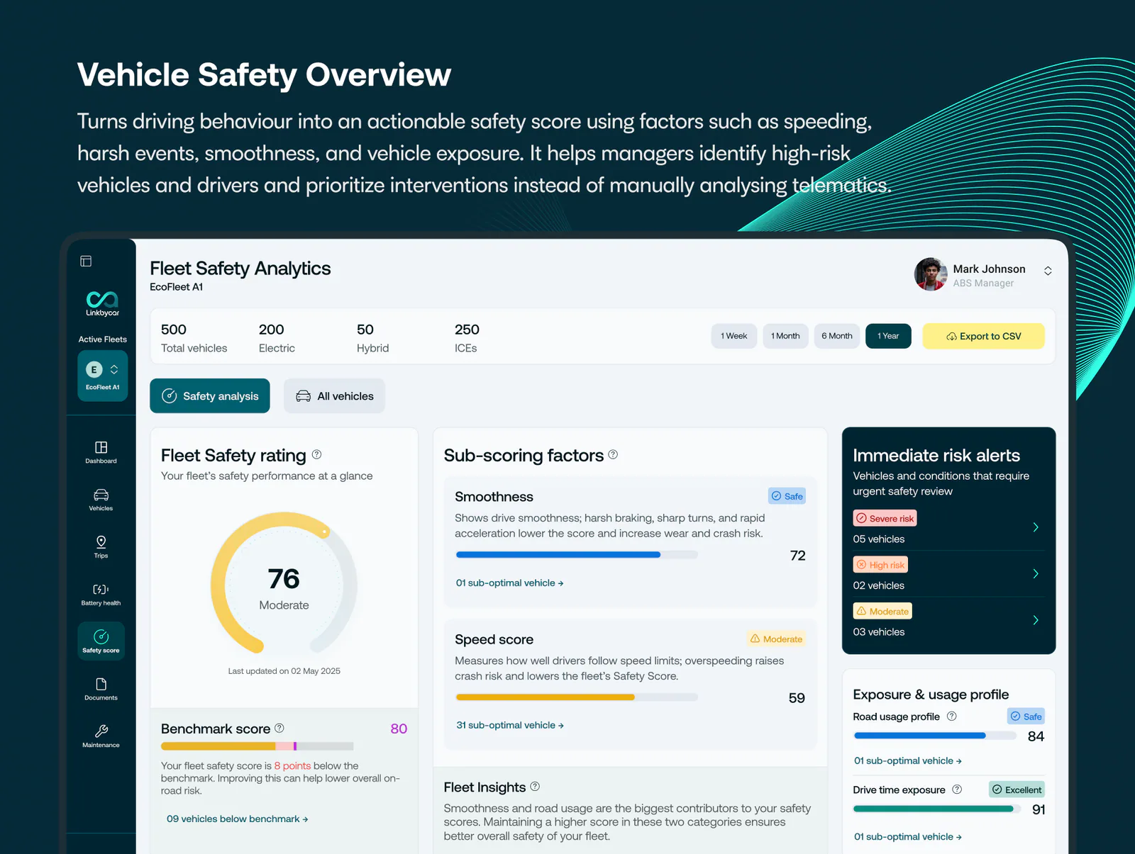
Driver and vehicle safety signals can include speed, braking, cornering and acceleration. The interface groups these events into a legible risk view while keeping the underlying categories available for review. A team can see a pattern before inspecting a trip, rather than treating a summary score as a verdict.
Language avoids accusation. The experience supports investigation and coaching by showing where a signal came from and how frequently it appeared.

07 / Audience variations
The same fleet tells different stories
A rental operator may prioritise turnaround and condition. A logistics team may look for route or driving exceptions. An insurer may need consistent risk evidence. Shared data does not require an identical hierarchy.
The product foundation allows modules and default paths to change by audience while preserving the same underlying interaction language. Variation happens in emphasis and access, not through disconnected products.
08 / Product foundation
A system for maps, tables, alerts and evidence
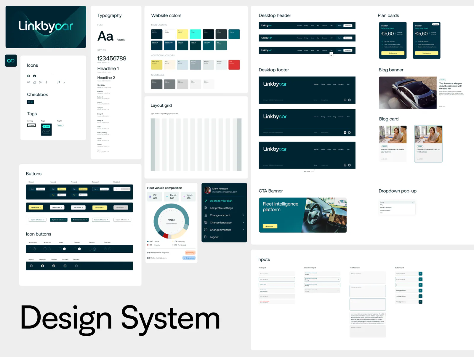
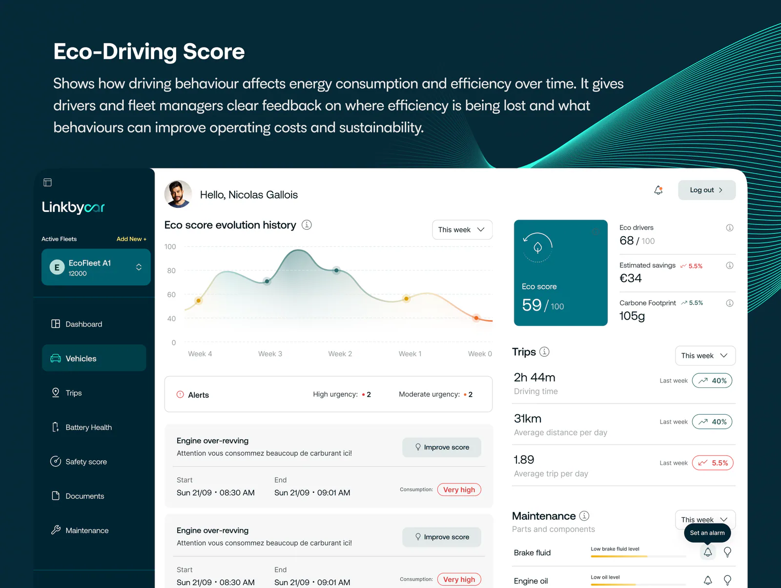
The component foundation covers navigation, filters, data tables, alerts, map overlays, scoring cards and visualisation patterns. Components encode loading, empty, warning and error behaviour so new features inherit operational clarity as well as visual consistency.
The system also gives product conversations a shared vocabulary. Teams can discuss how evidence, status and action should relate before creating another isolated screen.
09 / Evidence boundary
Show the contribution; respect what stays confidential
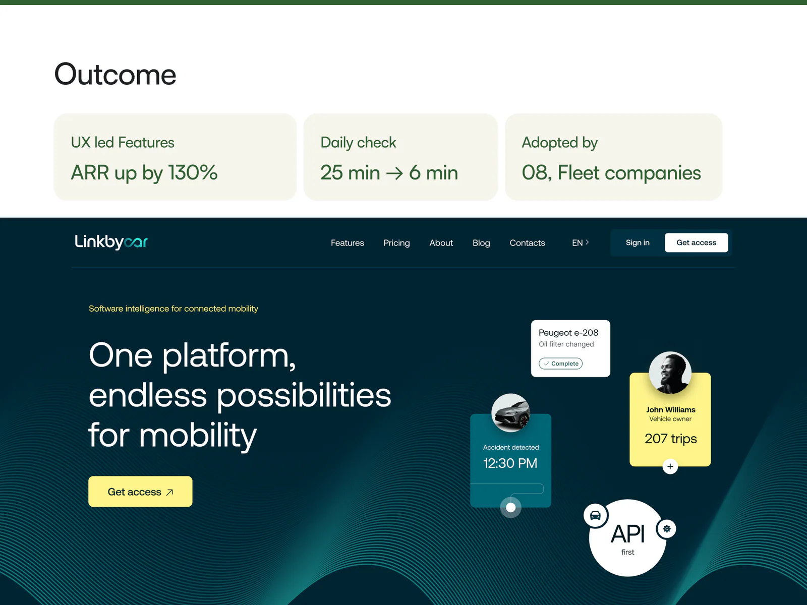
The public story documents the delivered dashboard, scoring experiences, information architecture, website and shared system. Customer, fleet and usage performance is not published. That boundary is intentional: it keeps the case study useful without implying evidence the client has not approved for release.
From the working archive
More from the archive
10 frames
Project references